Interior Design is the art and science of professionally creating a functional and aesthetically pleasing space.
Interior design is something that creates that relevant connection between your house and your lifestyle. So, basically this is what brings all the positive difference in your space.
And of course, it requires a keen eye for perfection and expert knowledge to bring that relevant change. For that matter we need to hire an Interior designer who works towards developing a healthier space with quality interior that is physically comfortable too.
In that case, even a slightest mistake would turn into a blunder and the space would become a chaotic mess. But of course we do not want to ruin that order and balance. For that the designers need to rectify certain don’ts and differentiate between the rights and wrongs of designing.
Here we look at 7 most common designing mistakes that could be avoided:
Over furnish the space
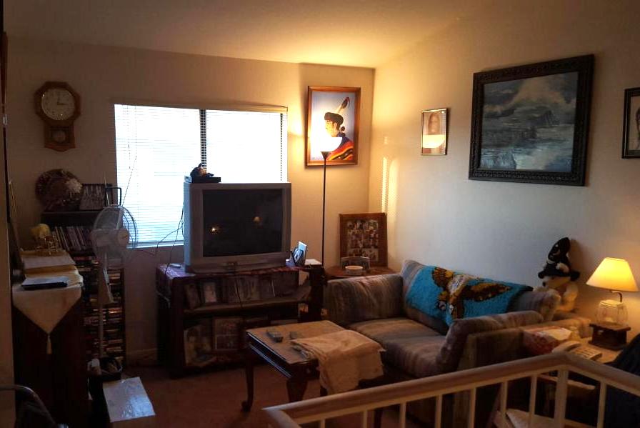
Designers put most of their creativity while installing furniture. This is the arena where they showcase their skills most, but while doing so some go for a number of items to decorate the space. This over furnishing can turn out to be their biggest mistake and while doing so they won’t even realise when the room turns from a well planned space to a muddled ground.
Designers should keep in mind that the furniture should make the place look appealing and functional at the same time and the furniture should not interrupt the movement. Over furnishing makes the place look clumsy and congested so this should be the first thing to be avoided.
Scale of furniture
Another common mistake they make is with the scale of furniture. Most people tend to put too many small things in a room which does not let the eye to focus on one. In that case, the formula that goes is “less is more” so that those few things could describe them self in the best possible way. While others put too many large, hulking items in one room which makes it look packed and over flowing. Some designers go for installing heavy and massive furnishings for small rooms that ruin all its beauty and functionality. Just go for the things that the user cannot do without or are really relevant to their idea of the space.
Yet there is no perfect theory for the scale of furniture to go for but the simple analysis on the same says that the designer should go for all kinds of shapes, sizes as per the needs of the space and the ultimate user. Designers should use tape and work according to perfect measurements to get the impeccable perfection with the same.
Insufficient lighting

Lighting is what infuses life into the space. It is a key element to focus on and still some go for dim lighting which makes the place look dingy. The space should have as much natural lighting as possible. What designers do is they, block natural light sources with dark coloured curtains and accessories which turn a bright sunny day to a dull evening. Natural lighting is what brings the positivity in the room and blocking it would be a blunder. Also, go for overhead lighting, that are in harmony with each other. The lighting should fulfil the very purpose of the space and should create that relevant mood that the user has planned for the space.
Wrong contrast

A very usual mistake that designers make is to paint the room before buying the accessories and furniture. This makes matching the furniture to the space very difficult since now they have to be very specific with the colour choice and style. But if the furniture is chosen first the paint colours can always be modified according to the space.
Bring several paint swatches home and go for the one that suits best. While paint swatches are very precise and can always adjust with room’s lighting, accessories and style. So here the simple designers rule says, “Paints should be the last thing to be chosen but the first thing to be applied.”
Carefree spending
Budget is the centre around which all the designing revolves. The designers have to stick to it and bring out the best from it.
Another stupid mistake that designers make is overspending to some extent. The designer sometimes do not realise the needs of the space clearly and go for wrong shopping. They should have a well established budget and plan made according to the number of rooms, the furnishing need of every room and the exact cost the user is willing to incur. Now the task is to get the best fitting pieces within the restricted budget limits.
Some designers first go for buying furniture and accessories for the space and spend a lot on the same. Now, getting short of funds they make compromises with other arenas of designing which ruins the overall plan. So a simple tip for designers- Don’t be too eager and don’t buy everything all at once.
Overspending initially would later put them in trouble. So, the best way is to for gradual spending and makes financial adjustments likewise. A finely created space is one that is designed over time so it’s best to go slowly and build slowly.
Missing on variety
The primary job that designers perform is to connect the space to the style of the user.
A space is created and designed while keeping certain points in mind. Every room in the area should be a reflection of certain style and design. But what some designers do is they curate the entire space in one focal idea and style. This makes their task easy but the space misses variety and assortment. This makes the place look boring and bland for the user and the visitors too. So designers need to use their creativity and bring versatility in their designing.
The idea is to make the place look aesthetic and that can be done in various ways, so why go only for one. The suggestion is different decor for ever area and avoid buying stuff from same store because it would more or less be similar to each other.
Trends can put them in trouble
What designers do is they showcase their skills with the means of latest trends set in the market. They are experts and know the vogue in prevail. They make a huge mistake by opting for something that is new in trend. Here, the problem is that the trend vanishes quickly. Within a blink of eye we see a change in vogue and what now the piece of furniture goes in trash. So, rather than going for trendy items focus on your client’s lifestyle. Put furniture that matches their lifestyle and reflects their personal preferences.
Wall backing furnishings
A very common yet avoidable mistake that designers commit is to put their furniture close to the walls of their room. What designers want to do is make the place look intimate by making the setting conducive to conversation but they end up placing pieces attached to wall which breaks the complete unity they were planning.
It is natural to want to place furniture against walls but avoid doing so to have a more friendly space. So, avail the benefits of pulling furniture away from the walls that create a space encouraging conservation by making a large room interactive. If you are from Chandigarh and looking for best Interior Designer you can consider http://interiordesignerchandigarh.in/


